the making of a supercandle
Design has always been a core part of our brand, driving everything from the distinctive look of our packaging to the precise merchandising in each of our architecturally unique stores. As a result, when it came to developing something as special as the cannabis supercandle – a statement-making piece that comes in a specially designed and equally impressive box – we knew we needed to work with an exceptional designer to get the job done. Enter Jonas Damon, industrial designer and longtime friend of our founder Andrew. With 25 years of experience working with prestigious names such as Vitra (where he and Andrew first met), Tom Dixon, Starbucks and Frog Design, Jonas had the breadth and the ingenuity to create the product we envisioned. For a glimpse into his creative process, here we present the origin story of cannabis supercandle, as told by Jonas Damon himself.
concept.
Because this product was so different there was some ambivalence about how to get started. To really kickstart it I brought in a set of images – of different shapes and materials, different products that actually had different design aesthetics and sensibilities – as kind of a trigger. The supercandle we’re designing could have any one of these different qualities, and I think those images introduced a very different thought process. And so these images... they were of vases and they were of wearable technology, architectural details... very different from candles and everything else. It kind of was a way to be playful, to escape thinking about decision-making. The escapism allowed Andrew and Ash [vice president of creative] to... say, "Oh, these images here, they remind us of our brand, these feel very close to what it is we do without being very literal. These images over here, on the other hand, are very much not about who we are and what we represent. They are too precious, they are too cold, they are too clinical…" I collected those images they were leaning towards and those images then were very indirect influences on the design process.
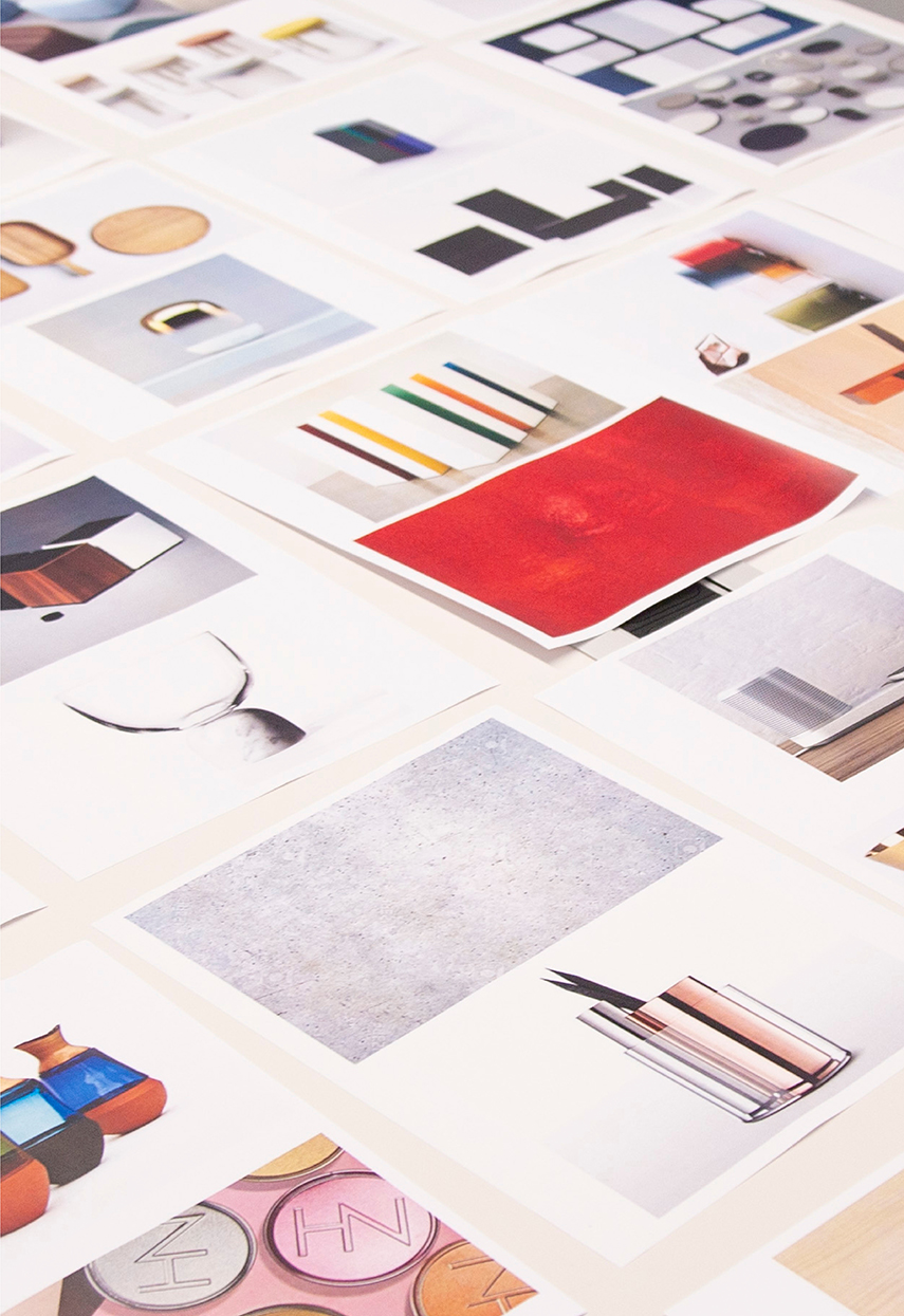
Some of the qualities that we distilled from those images were soft, modern, warm, human, clean, simple, approachable, precise. Each word on its own might be too extreme or might take things in the wrong direction, but together they balance one another out. "Soft" on its own could sound a little bit too fluffy or light. But combine "soft" with "precise" and all of a sudden… those words balance each other out and you can kind of derive a design language from that.
development.

We got the ball rolling [with] essentially a year of development time. Design, sourcing, quality, sampling and all that. I think the first set of design concepts I brought to the table were very varied directions... but all of them could have sat comfortably within the brand. From those first few concepts we chose one – one concept, one specific idea, but we can execute the idea in these three different ways. We continued doing that, narrowing down... and the whole while we tried to really distill the relationship to the brand. We want to evoke apothecary. We want it to be a reusable container or vessel, something that after the initial life of the candle... can continue to provide value. What else can it be when it's completed? That was always part of it and that was always a way that allowed us to make decisions about refining the design.
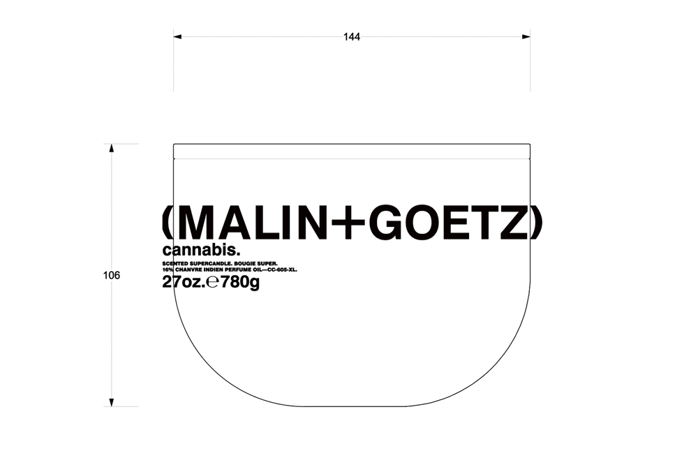
The material quality was a huge element. We never wanted this to be a single-use piece of packaging. It’s quite large and we made it out of relatively thick glass. We gave it a lid as well. If you don’t want the fragrance in your environment all the time, you put it on and it kind of... contains it. When the candle is gone, you have a lid and you can keep anything that you keep in there dust-free. In our apartment I could see a myriad of these vessels... [with] a collection of anything from loose buttons and Lego pieces and caps to Pantone swatches for my work. Hopefully it’ll become as iconic as, say a Mason jar. When you have Mason jars on your shelves… they don’t hold food anymore necessarily but they’re too nice to throw away. It’s sort of the same idea.
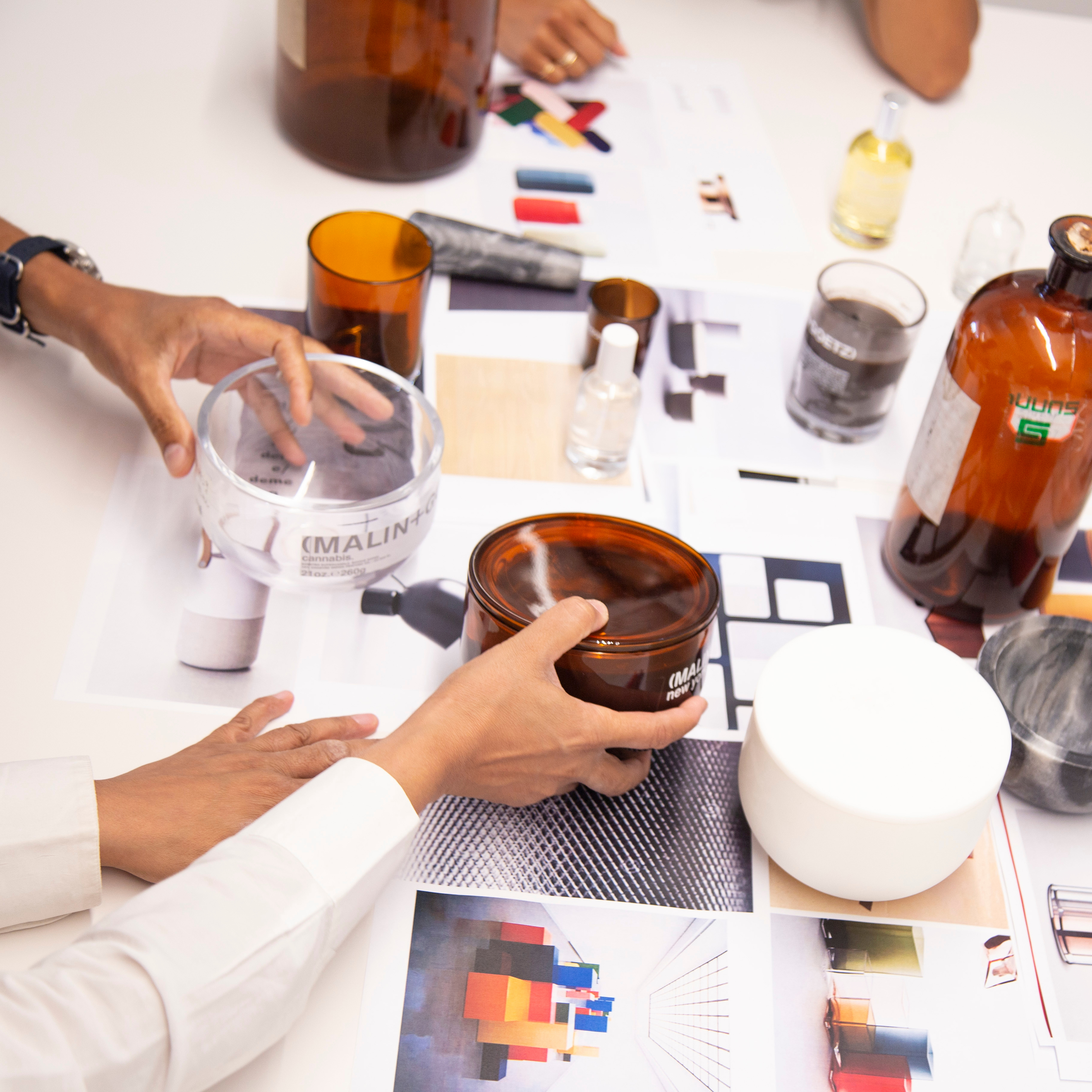

This being a very different product, I think it’s important to choose a scent that is very successful, very important, very core to the brand. The supercandle container actually is inspired by a mortar and pestle. Wanting to evoke some of the apothecary roots of the brand, we were very intrigued by using this amber lab glass. If we look at the stores, you see a lot of these amber-colored or brown-colored vessels and jars... But those are props and we wanted to make that connection to traditional apothecary in a modern way. With that look, with that aesthetic, the cannabis scent made a lot of sense. The shape of the vessel, the mortar reference, the desire to use this amber apothecary glass, this heady fragrance that kind of matches those other elements very well. That’s how it all came together.